Chart cell
NotebooksThe Chart cell provides a no-code option for building, exploring, and customizing charts with Observable Plot. With point-and-click menus for variable selection, aggregation (e.g. mean, sum, or count), faceting, color mapping, and more, the Chart cell makes it possible for anyone—regardless of programming experience—to quickly create and iterate on data visualizations.
Add a Chart cell
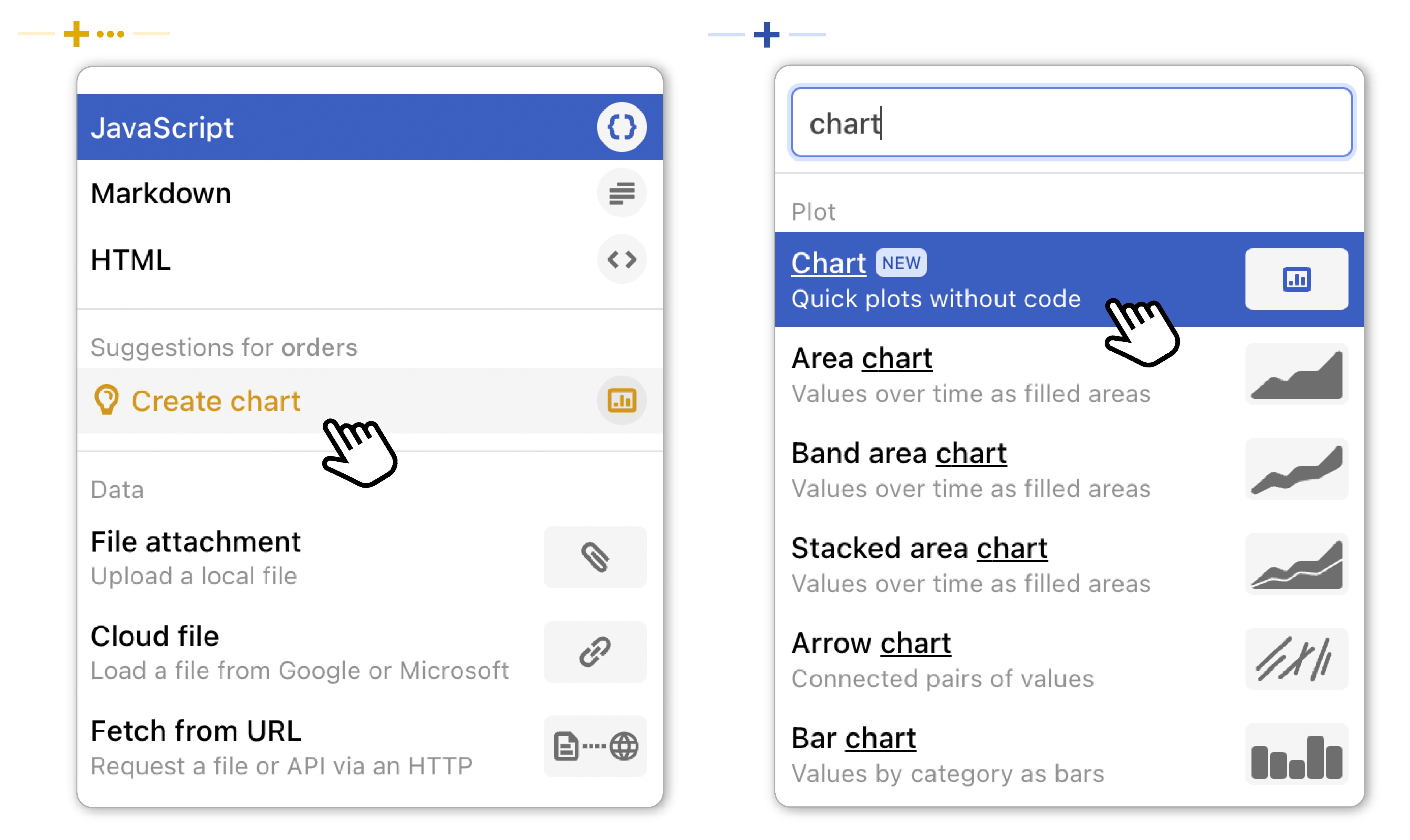
To add a Chart cell, open the add cell menu by clicking the gray plus sign () in the left margin of a notebook. From there, two things can happen:
If the previous cell in your notebook contains data (including in a JavaScript, data table, or SQL cell), you will see a suggestion to “Create chart” in gold in the add cell menu. Click to insert a new Chart cell using the previous cell’s data.
If the previous cell in your notebook does not contain data, search or navigate to “Chart” in the add cell menu. Click to insert an empty Chart cell, then choose an available data source (from a cell or attached file) using the drop down menu in the cell header.
The two add cell menu scenarios for inserting a Chart cell are shown below:
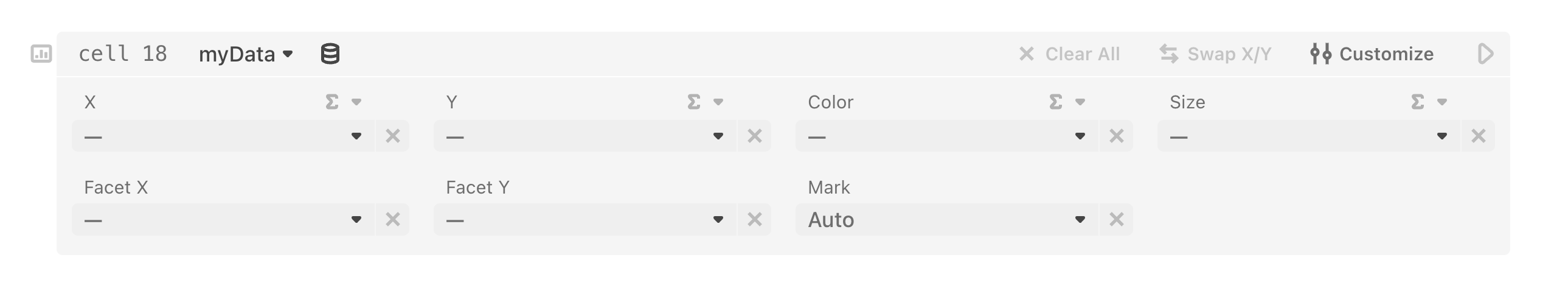
Once selected, a Chart cell is inserted into the notebook. A new (blank) Chart cell is shown below:
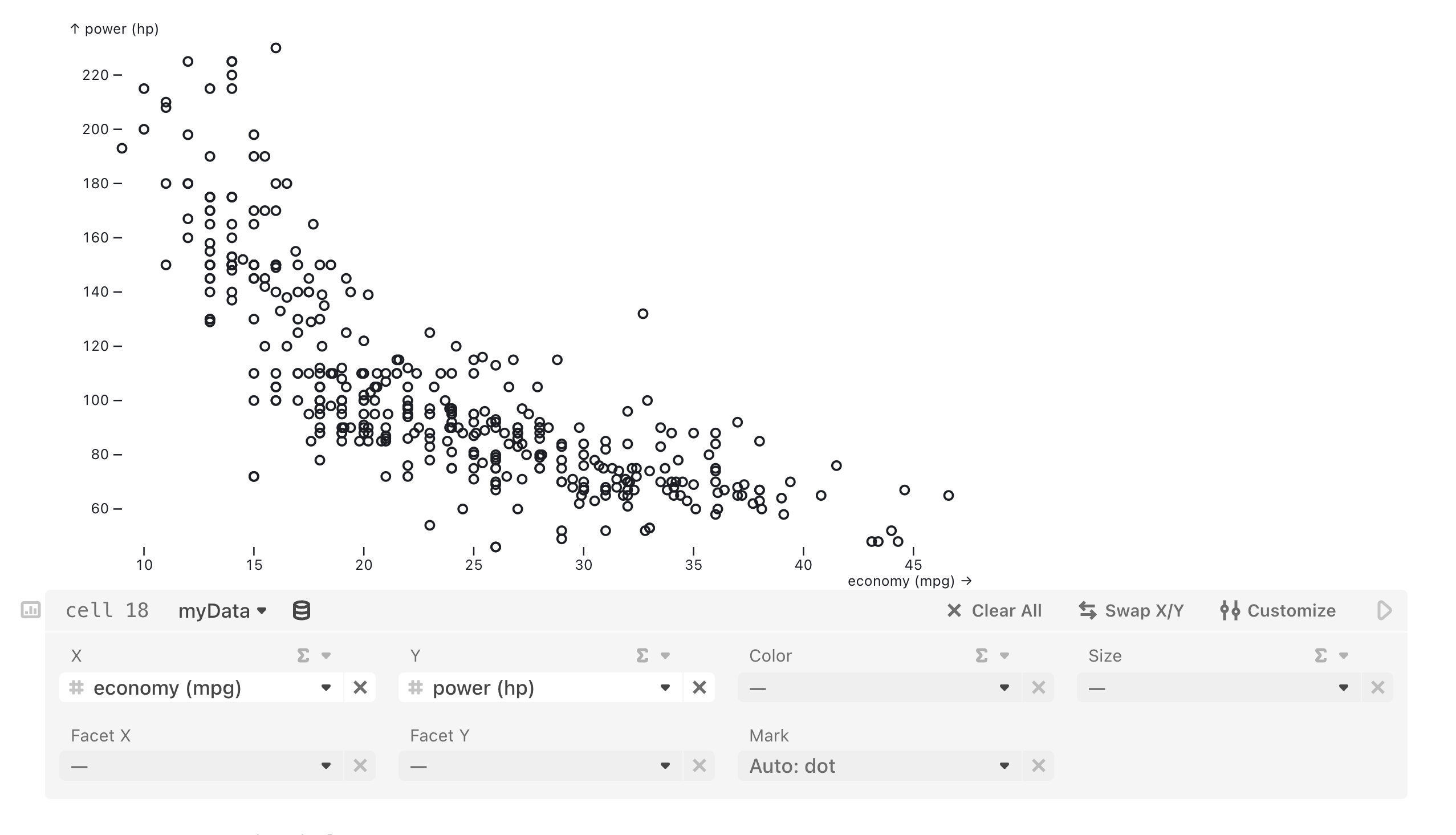
Choosing variables for X and/or Y reveals a chart above the cell:
To change the data source in the Chart cell, open the dropdown menu alongside the current data source and select an alternative source that exists in the notebook:
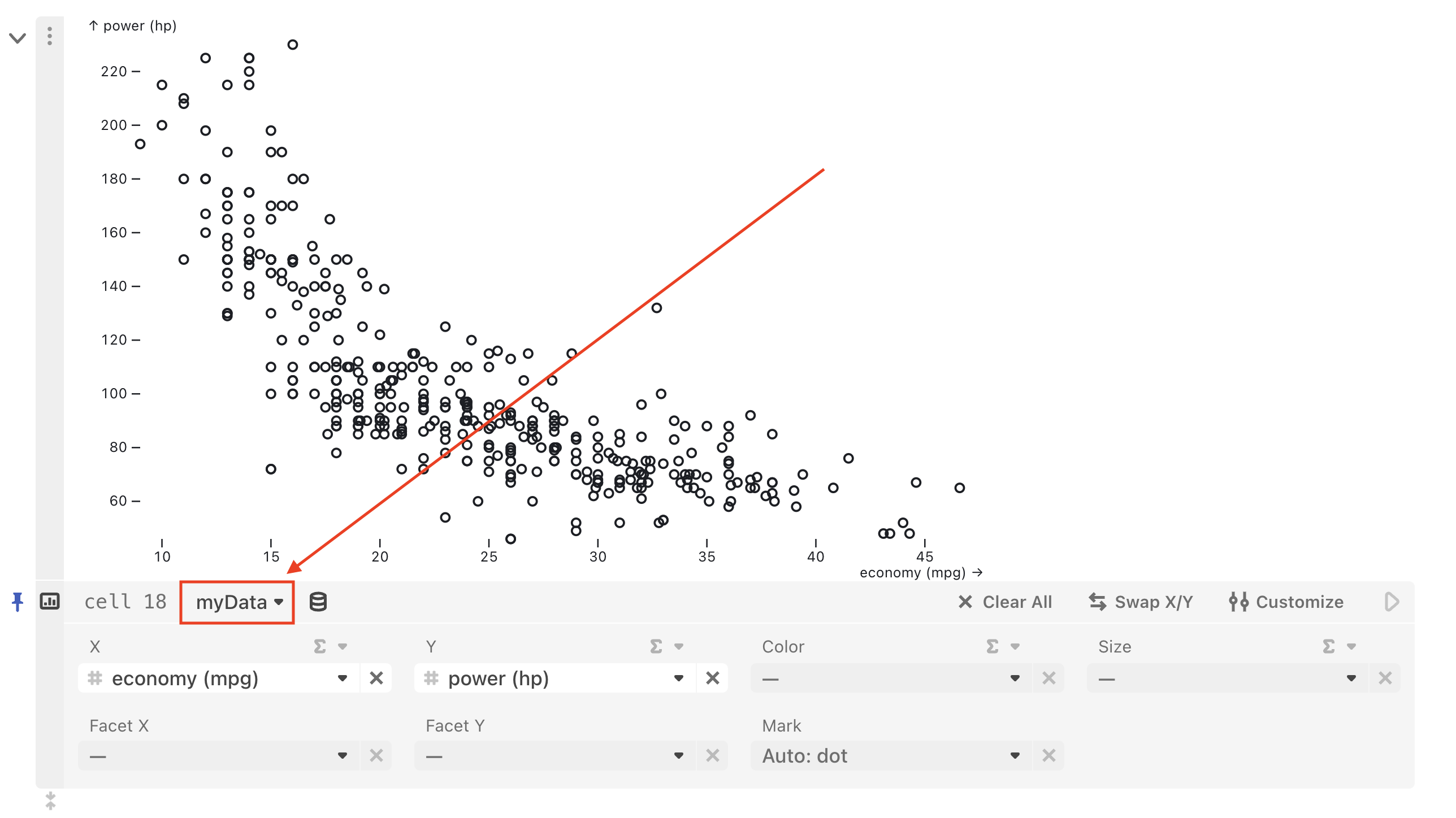
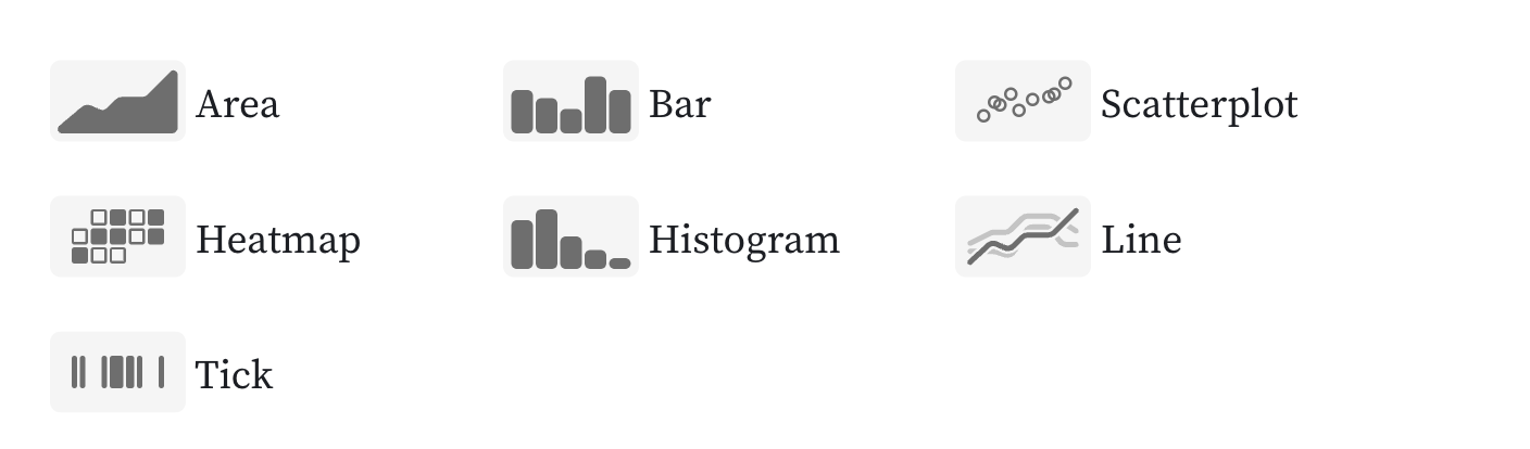
Chart types
Under the hood, the Chart cell employs Plot.auto—a special mark that automatically selects a mark type that best represents the given dimensions of the data according to some simple heuristics. Depending on selected variable types, the following chart types are currently possible in the Chart cell:
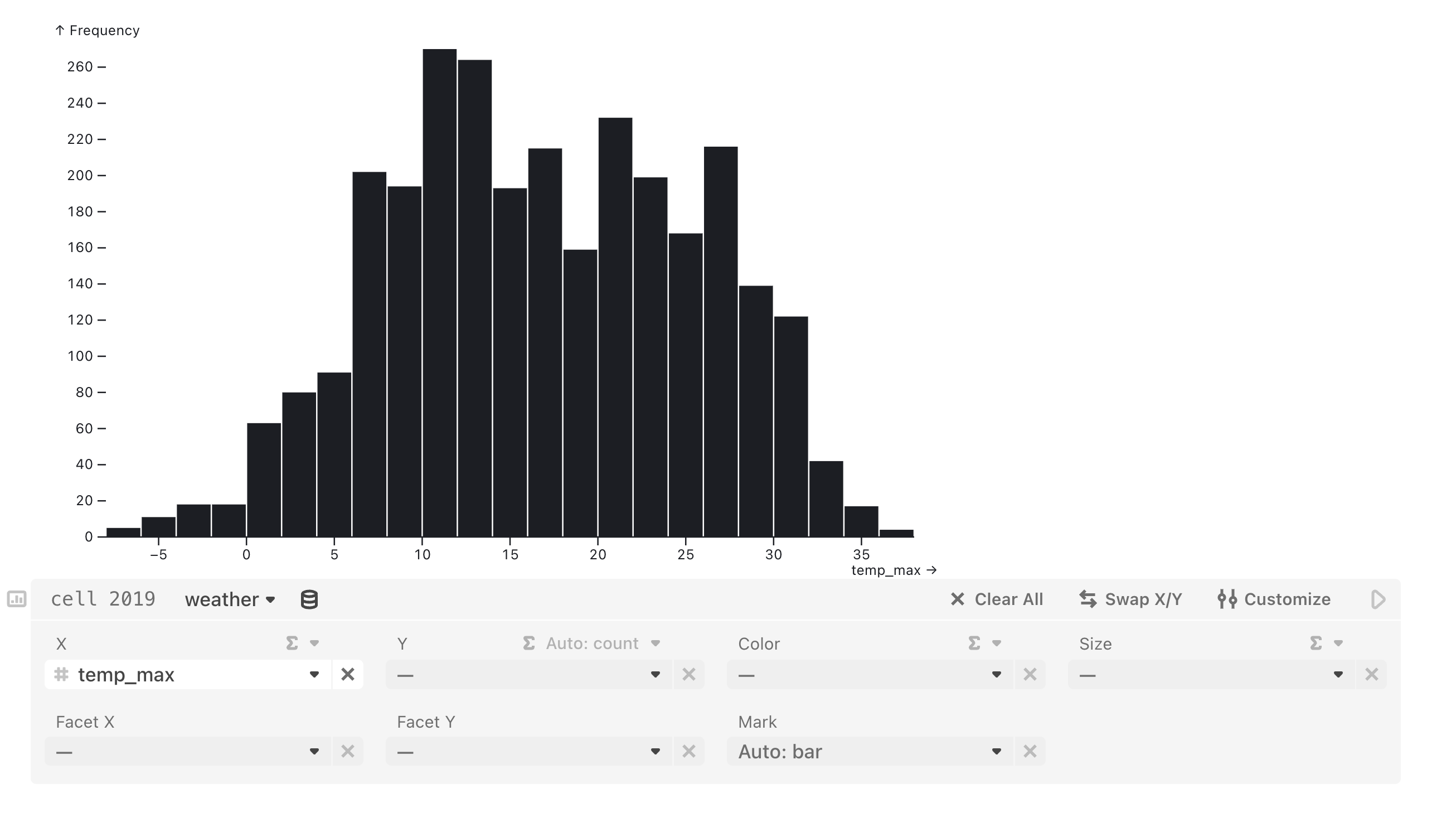
When you pick a column for x or y, the Chart cell will show a histogram (or bar chart) of the frequencies of different values in that column. The Chart cell will automatically bin values if the data is numbers or dates, or group them by unique categories if they’re strings. The dropdowns will show the automatic selections that made the chart (like “Auto: count” and “Auto: bar”), which you can always override.
Examples
The screenshots of the charts below are created entirely using the Chart cell.
Setting either x or y to a column of your data renders a histogram. Note that, below, the y reducer says “Auto: count” and the mark says “Auto: bar”, each of which you can override.
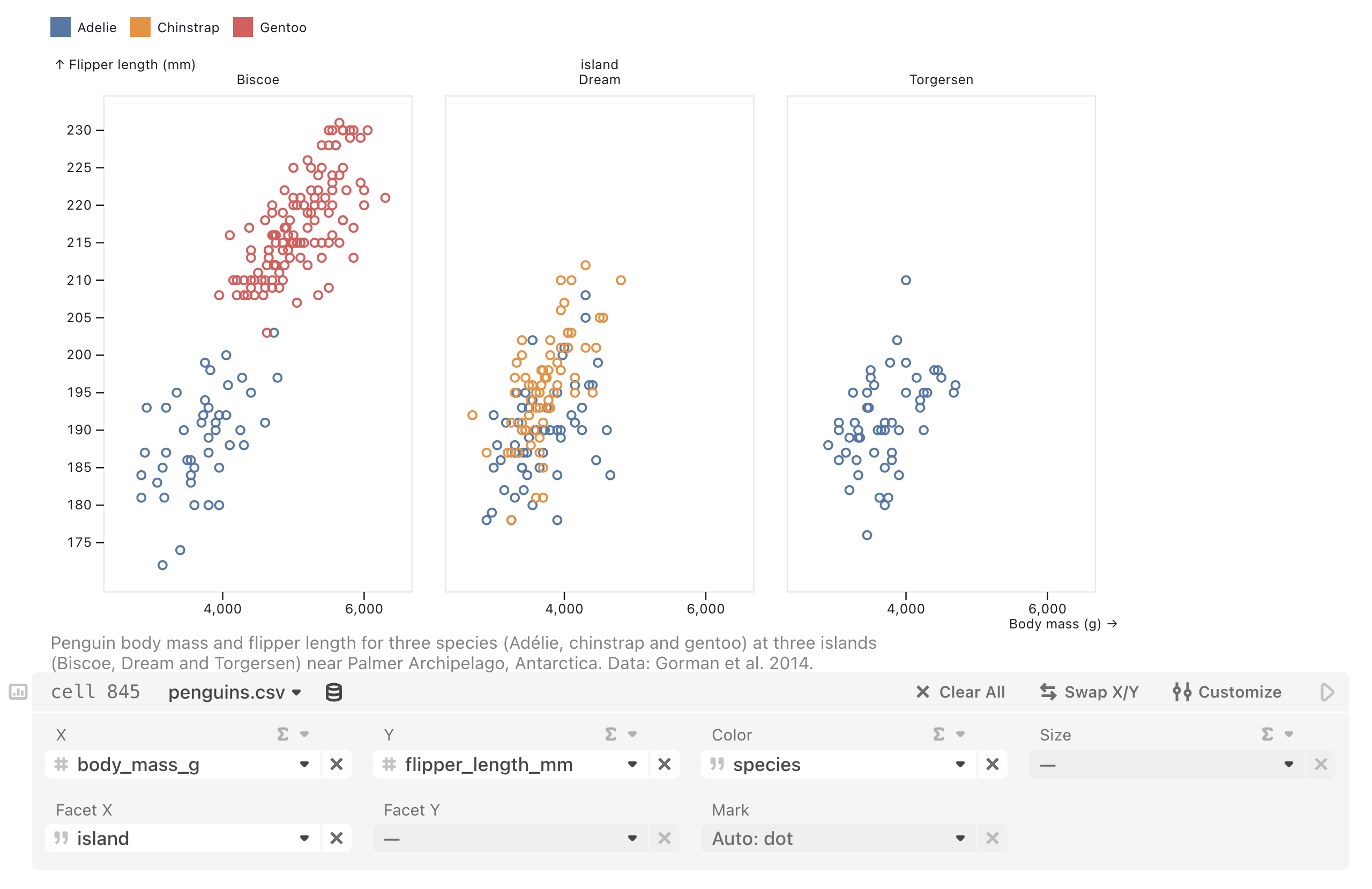
Selecting numeric columns of your data for x and y, then selecting a category for Facet X, renders a faceted scatterplot. Here we’ve also set color to species.
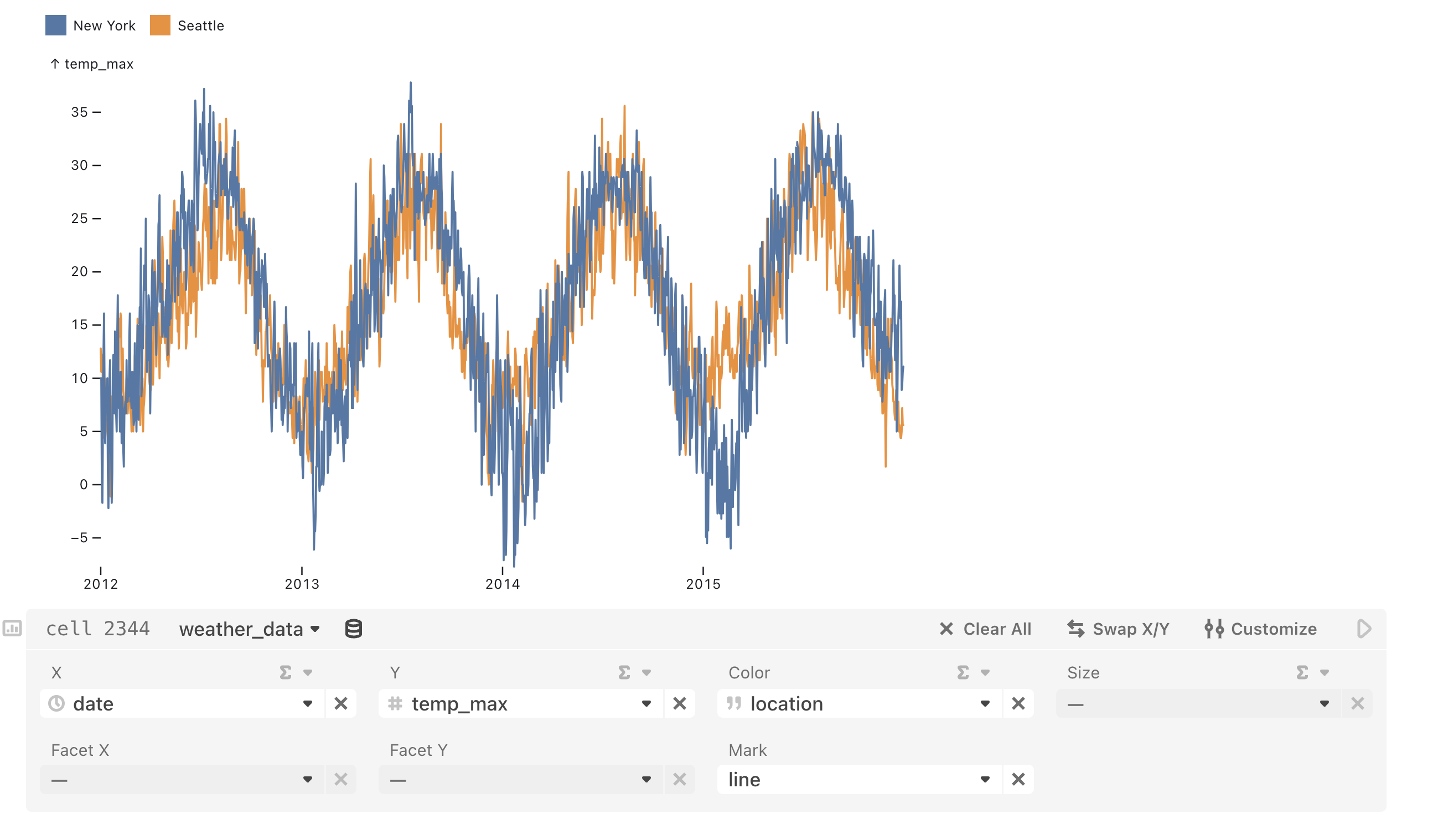
Selecting an x and y where one of them (usually x) is continuous and sorted, e.g. by date, then updating the mark to line will produce a line chart. Here, we additionally choose color to visualize different series by location.
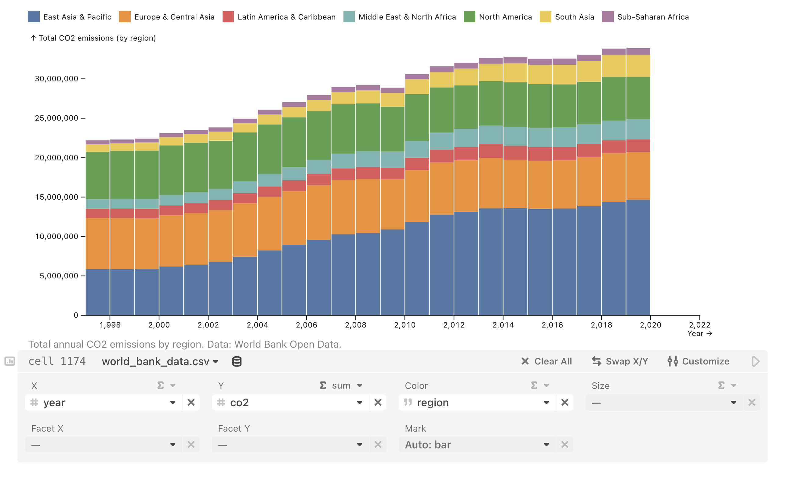
A stacked bar chart is rendered by selecting one column for x; then, for y, we’ve selected both a column (co2) and the sum reducer; we make it stacked by picking a categorical column for color, which segments the bars by that category.
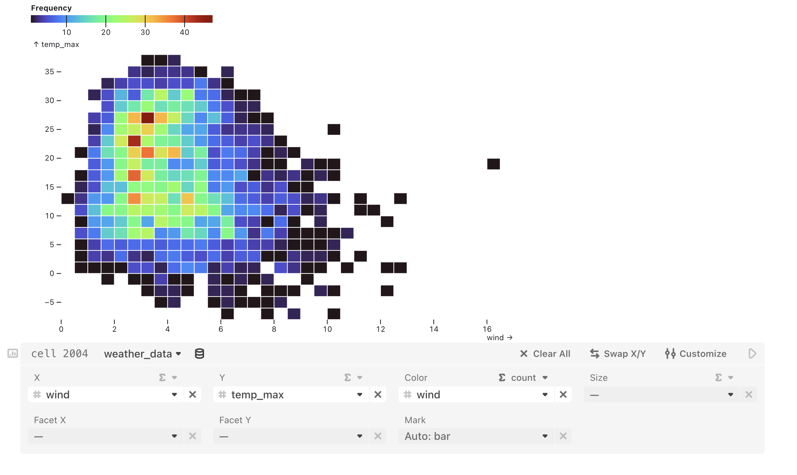
Selecting columns for x and y, then choosing a “count” as the reducer for color, will produce a heatmap.
Reducers
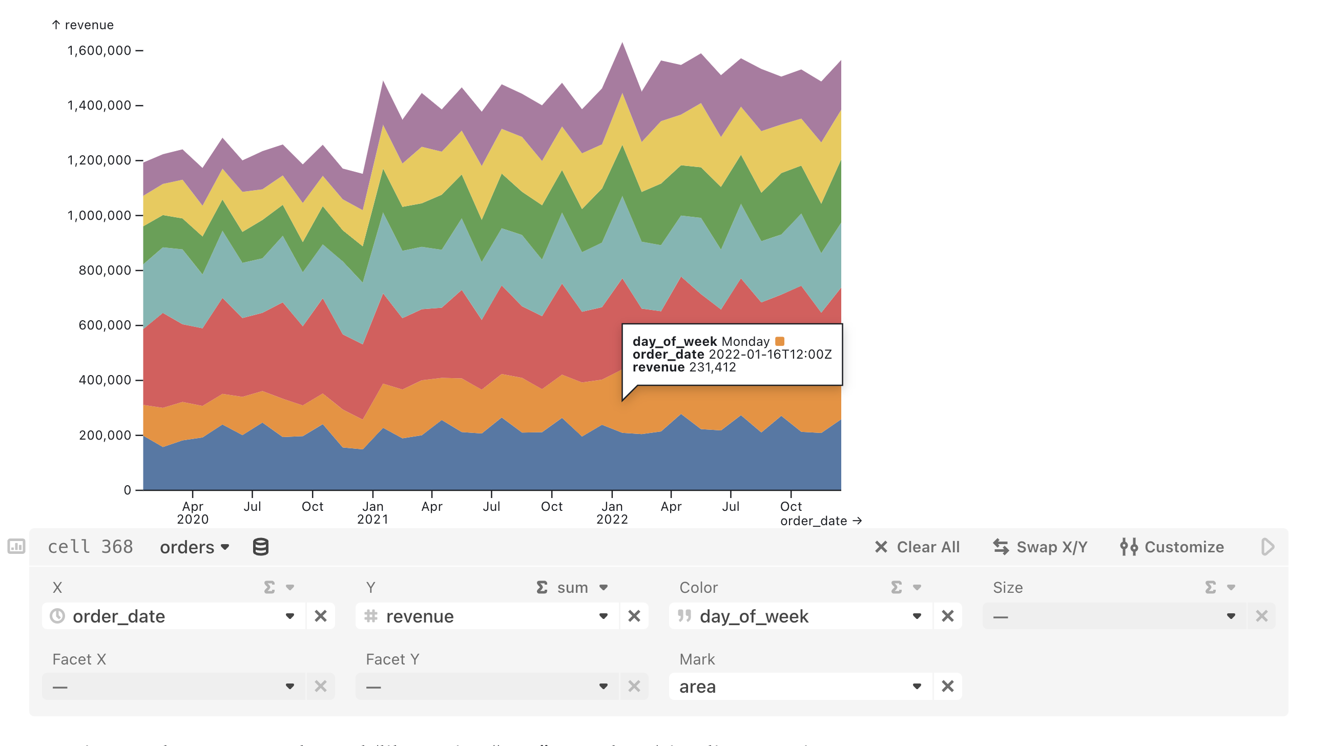
For x, y, color, and size, you can pick a reducer from the menu above the field dropdown. The following reducing functions can be applied: count, distinct, sum, min, max, mean, median and mode. For example, the Chart cell below produces an area chart of pizzeria revenue (sum of the revenue column on the y-axis) over time, with color indicating different days of the week.
Setting a reducer on one channel (like setting “sum” on y above) implies grouping (for categorical data) or binning (for numeric or temporal data) one or two other channels:
| Setting a reducer on | Groups or bins on | To make a |
|---|---|---|
| x | y | Horizontal histogram |
| y | x | Vertical histogram |
| color | x and y | Heatmap |
| size | x and y | Dot plot |
Fields
With the Chart cell added to a notebook and connected to a data source, you can update field selections using the dropdown menus to control the variables, chart type, color and size channels, and faceting. A long dash (—) in the dropdown menu of any field indicates that a variable has not been selected.
| Field | Description |
|---|---|
| X | Select the x-axis variable and an optional reducing function to apply (e.g. sum, mean, count). If only one variable is selected, a histogram or bar chart is created by default. |
| Y | Select the y-axis variable and an optional reducing function to apply (e.g. sum, mean, count). If only one variable is selected, a histogram or bar chart is created by default. |
| Color | Select either a single color to apply to all marks or a variable that is mapped to a color channel, and an optional reducing function to apply (e.g. sum, mean, count). Color updates the stroke color for line and scatterplot charts, and the fill color for area, bar, and heatmap charts. |
| Size | Select a variable that is mapped to dot size ®, and an optional reducing function to apply (e.g. sum, mean, count). |
| Facet X | Select a faceting variable to split the chart into separate panels side-by-size horizontally (one for each distinct value in the faceting variable). |
| Facet Y | Select a faceting variable to split the chart into separate panels vertically (one for each distinct value in the faceting variable). |
| Mark | Select a different Plot mark (auto, bar, dot, line, area, or rule). |
Buttons
Iterate and explore charts further using other features of the Chart cell that let you clear selections (for one or all fields), swap x and y variable selections, and customize your chart.
| Button | Description |
|---|---|
| Clear selection for the given field | |
| Clear all | Clear selections for all fields |
| Swap X/Y | Swap selected X and Y variables in chart |
| Customize | Open customization pane (to update chart dimensions, margins, labels, gridlines, color scheme, scale types, reverse a scale, add or remove a legend, and add a caption) |
Data types
The data type of a column (e.g. numeric, string, date, etc.) may determine what kinds of charts are possible. Icons to the left of the column names in the dropdowns show the data type for each.
| Data Type Icon | Description |
|---|---|
| Numeric | |
| String | |
| Date or datetime | |
| Boolean (true/false) |
The Size field updates the radius for a dot mark, and can only be updated using quantitative data (i.e. continuous or discrete numeric values).
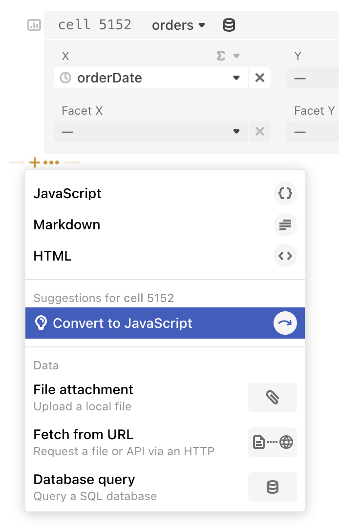
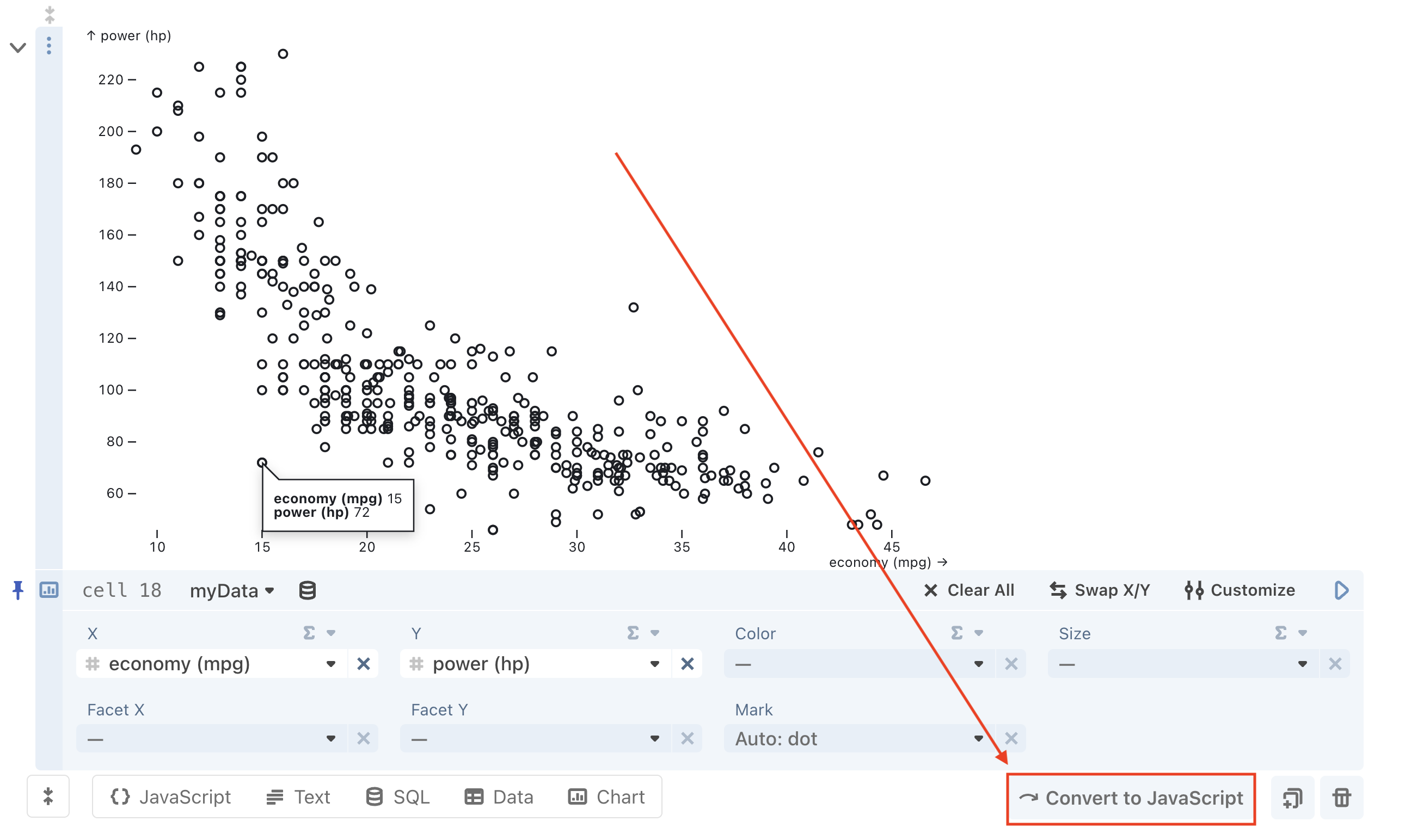
Convert to JavaScript
You can convert a Chart cell to JavaScript to create a new cell with the underlying, equivalent, Plot.auto code. It’s a regular Plot mark, so you can combine it with other marks or pass in any of the standard Plot options. For more information, see the Plot.auto documentation.
One way to enact the conversion is to hit the ‘Convert to JavaScript’ button at the bottom-right corner of a focused Chart cell:
You can also select the add cell button below a Chart cell and you’ll see this suggestion: