

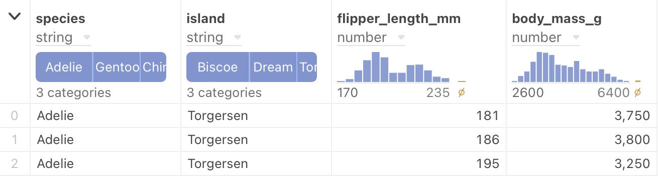
Data table cell
NotebooksThe data table cell cell mode provides you with an easy way to put your data in table form. You can quickly scan multiple columns of information and mouse over the top-of-column summaries to explore the range of values.
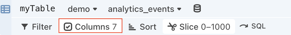
There are multiple data wrangling options available with the data table cell:
- Filter - Limit displayed results to matched criteria.
- Columns (Show/Hide) - Show or hide only certain columns.
- Derive columns - create new columns derived from the original columns using JavaScript.
- Sort - Sort columns into ascending or descending order.
- Slice - Define a slice of data so that only limited rows are shown.
Add a data table cell
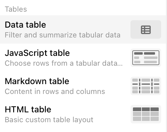
To create a data table cell, click the + above or below a cell to open the add cell menu and select Data table.
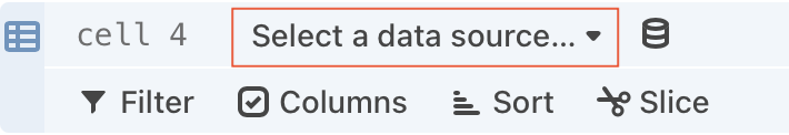
Select a data source
Data table cell supports Apache Parquet, Apache Arrow, CSV, TSV, and JSON file types that have tabular data, as well as database connections. In addition, any named cell in your notebook that already contains tabular data (i.e. an array of objects), you can select that as a data source.
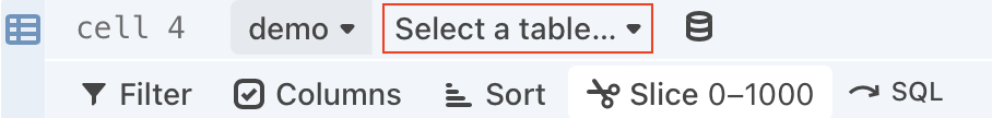
Database connections
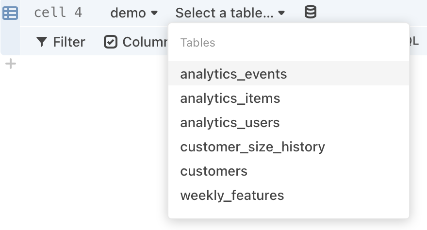
When working with relational databases, you must select a specific table to view:
Note
If you selected a BigQuery database, you need to enter the projectname.schemaname.tablename, rather than selecting a table name.
Modifying data
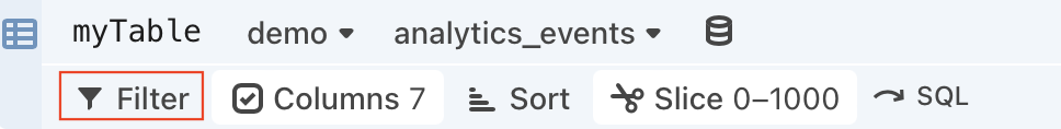
There are many different ways you can wrangle data with the data table cell, such as filtering, sorting, showing/hiding columns, deriving new columns and slicing.
Filter
Data table offers robust filtering options.
When you click on Filter, you will see a menu that asks you to specify a colum and an operator.
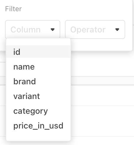
Once you have selected an item from the Column menu, appropriate choices appear in the Operator menu, and an additional field appears so that you can enter detailed criteria:
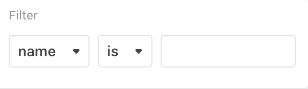
The types of comparison operators available depend on the type of value in the Column field. For example, string values allow for is, is not, contains, while numeric values allow for <, >, or is not null.
Additional Notes
- Object values do not support operators.
- You can define multiple filter criteria. Once you complete the first row of filter criteria, a second row appears. You can then define filter criteria based on a second column of data.
- It is possible to define filter criteria that are contradictory.
- The order in which you define the filtering criteria does not matter.
- To delete a row of filter criteria, click the “x” that appears to the right of each row.
Show and hide columns
Click Columns to display the list of table columns.
The resulting list displays checkboxes indicating which columns are to be shown.
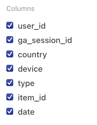
By default, all columns are shown. You can hide specific columns by unchecking the checkbox for a given column.
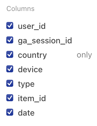
If you hover the pointer over an individual item in the list, the word only appears. If you click only, all other columns are de-selected.
To restore all columns to visibility, select Show all.
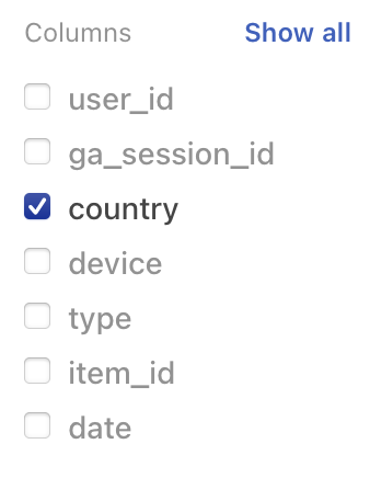
Note that if you de-select all columns one-by-one and then add them back individually, the columns appear in the order in which they are added. Selecting Show all (or selecting all columns) restores the original display order.
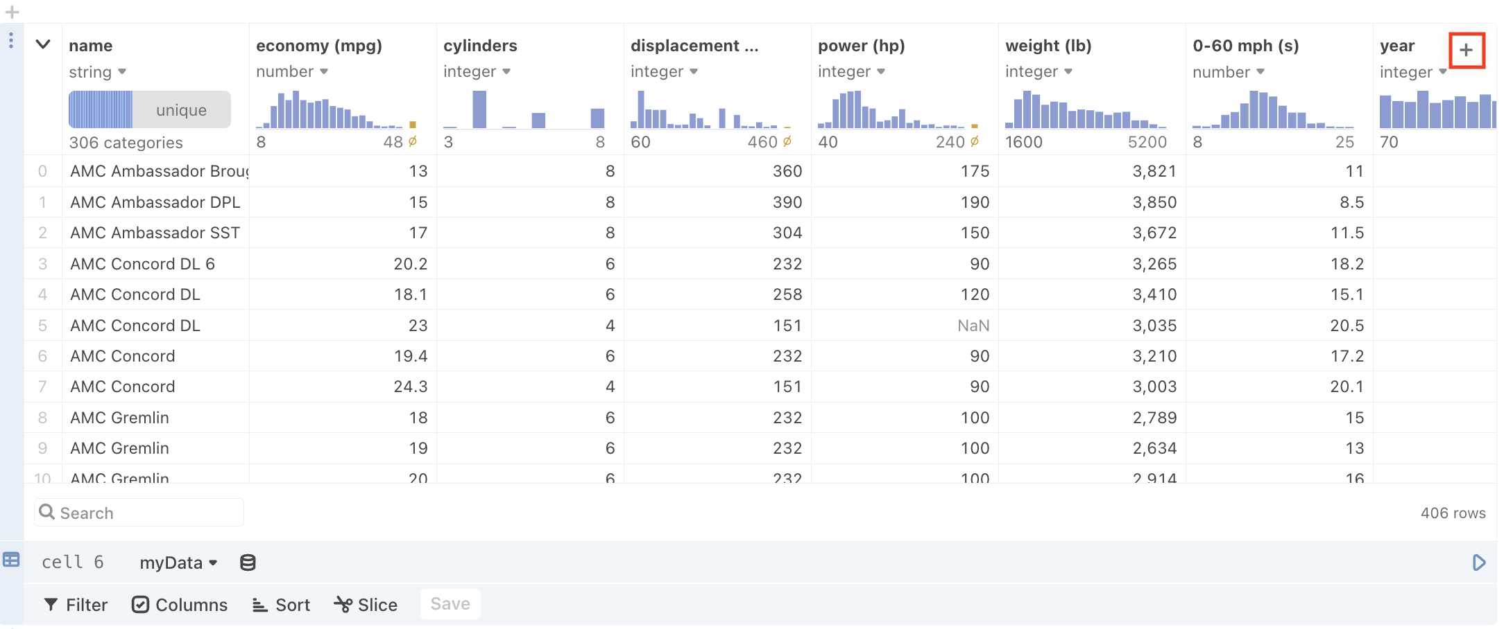
Create new columns for column derivations
New columns, derived from the original columns, can also be added to the data table cell. To do so, click the + button in the upper right-hand corner of the table view, as seen here:
and the new column will appear highlighted in blue to the right of the original columns:
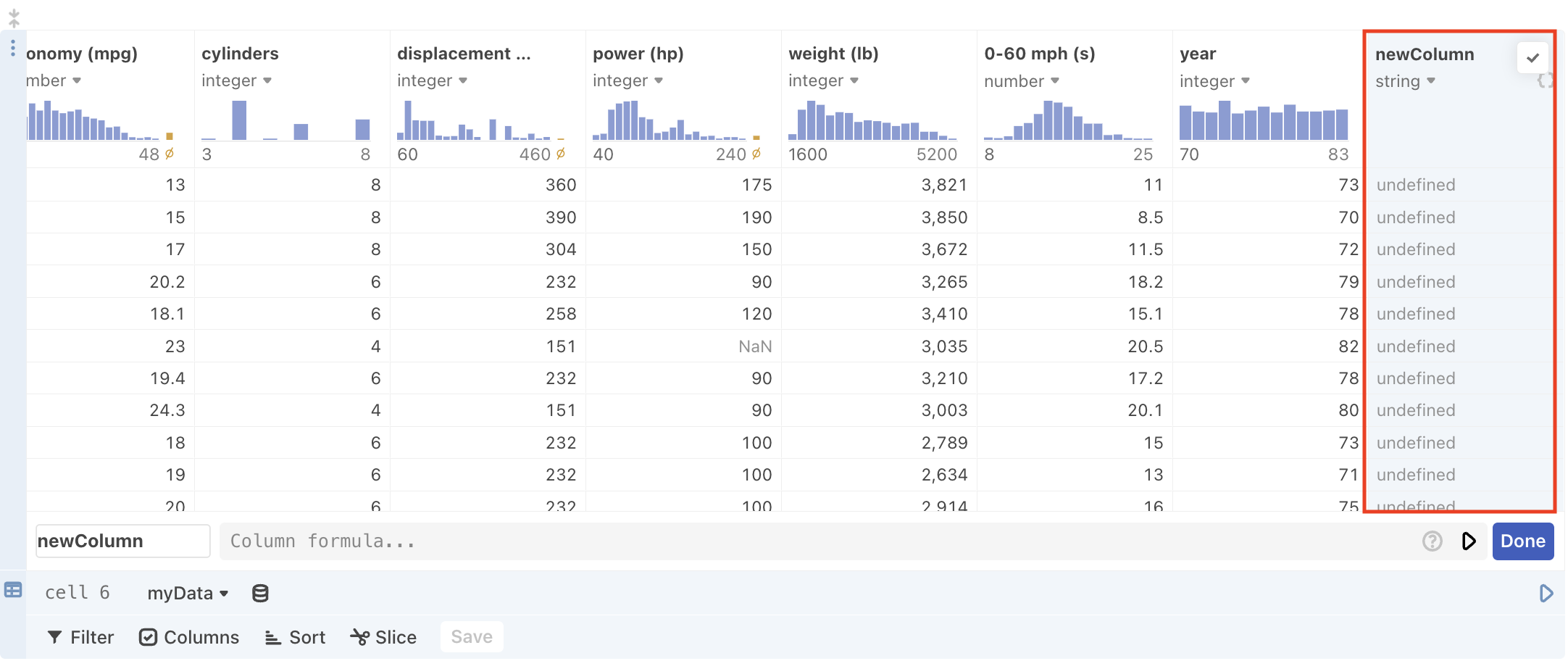
The editor also appears when you first create a column:
which allows you to name your new column and define the derivation with an expression.
Note
Data types for derived columns are inferred and overridable just like the other columns in the table.
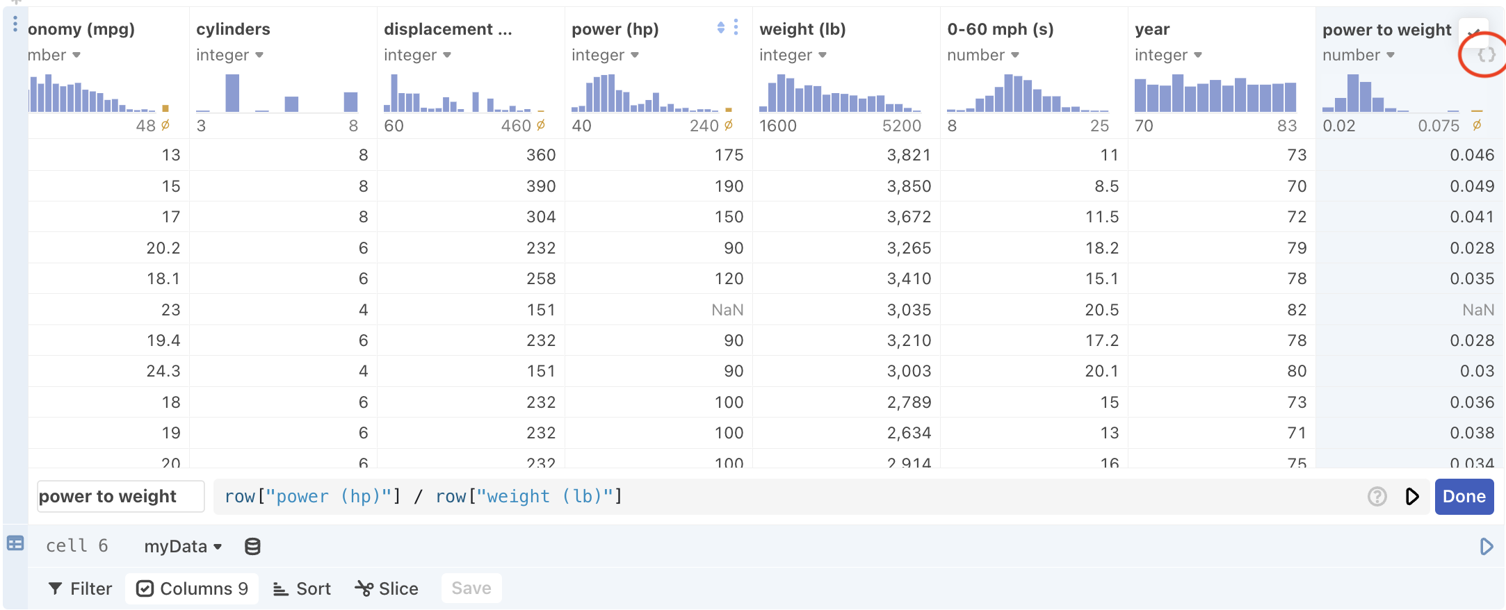
After you click the Done button, the view of the Data cell table will revert back to normal. However, you can edit an existing expression as needed by clicking the {} icon in the column heading:
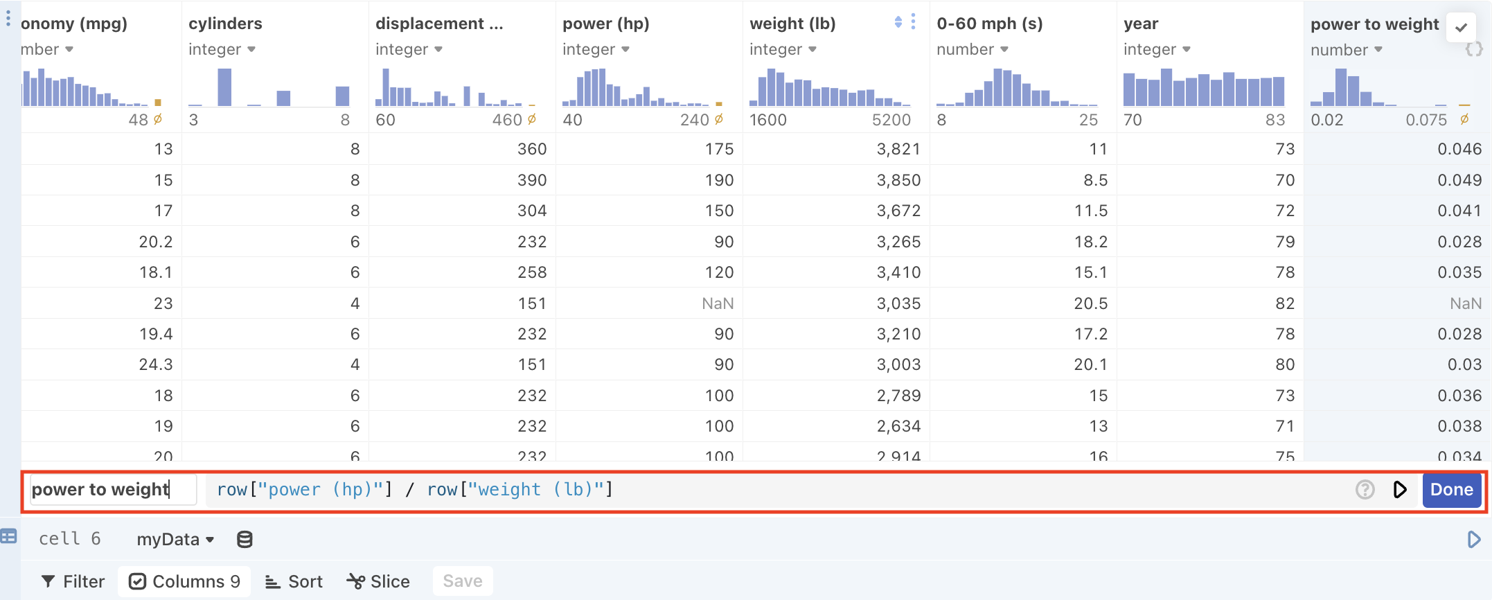
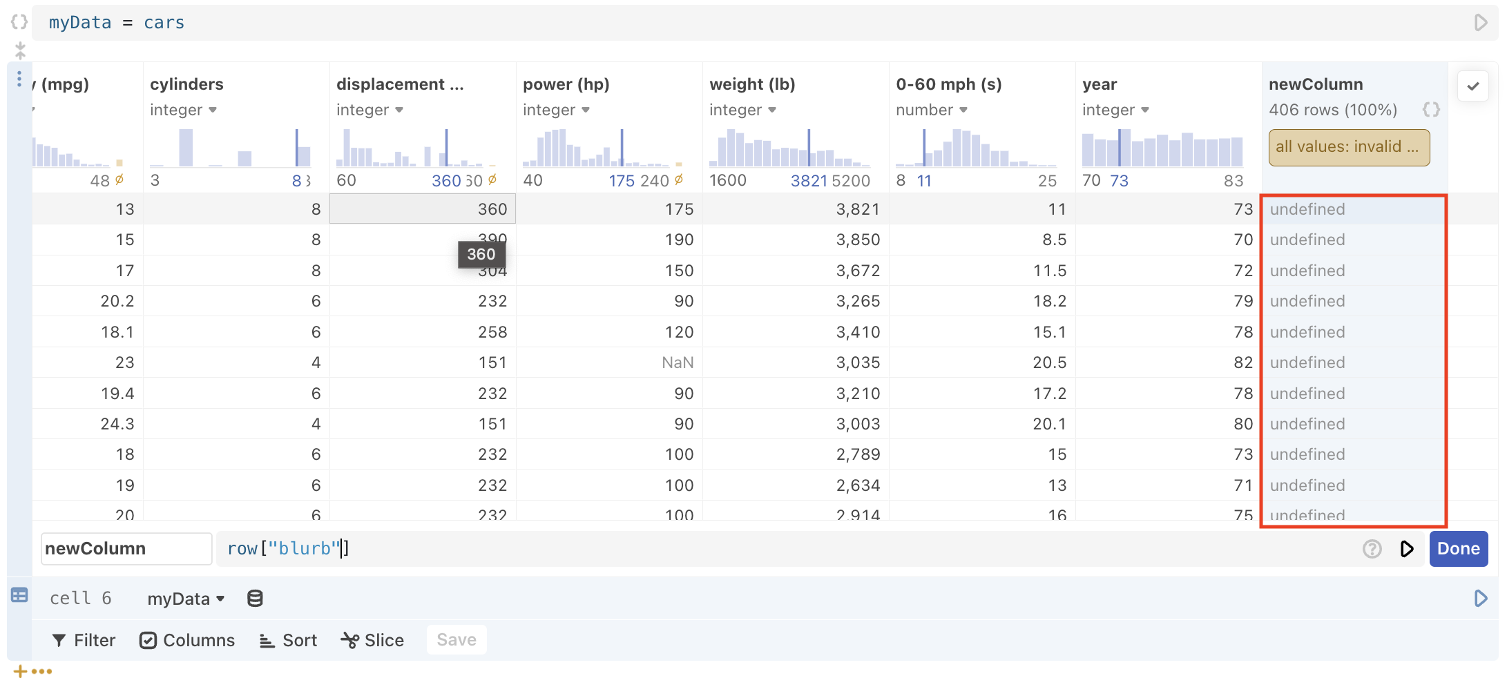
Writing expressions to define a newly created column
A built-in object called row allows you to access other column data that can then be applied to each row one at a time in the derived column. For instance, the above screenshot derives a new “power to weight” column by dividing the value from each row in the “power (hp)” column by value from each row in the “weight (lb)” column.
You can perform most of the computation available in normal JavaScript cells. This includes the ability to write arbitrary JavaScript expressions, reference the output of other cells, and call functions defined in other cells. There are some notable limitations to what you can do with this cell:
- You cannot render HTML or a Plot in the cell.
- You cannot render an input in the cell.
- You cannot reference another derived cell.
- You cannot access an entire column of data from within the expression cell (i.e. all of the rows at once), only each row one at a time (i.e. using the row object).
Error Handling for deriving new columns
There are a couple of scenarios that cause errors with column derivation:
- Referencing a bad or non-existent column name, or make a syntax error in the expression cell, the table produces invalid results like
undefinedorNaN.
- When you run the cell using either
Shift+Enteror the play button, but include a mistake that causes a runtime error (for instance, by using an undefined variable) the data table cell collapses other than the column headings, a search field, and the expression editor. You can then use the expression editor to fix the code.
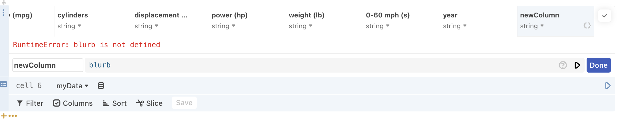
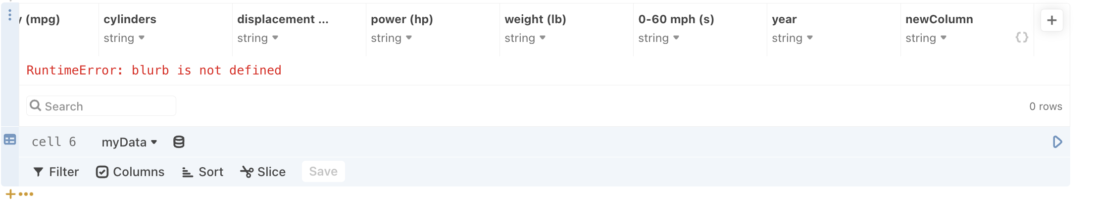
Shift+Enter or select the play button.- When you cause a runtime error, but select the Done button instead of
Shift+Enteror the play button first, the table collapses and the expression editor is closed. You can open the editor back up by selecting the{}button at the top of the new column and fix your the code accordingly.
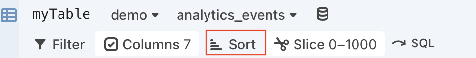
Sort
Use Sort to arrange the items in the table into order:
using any of the columns as a sort key:
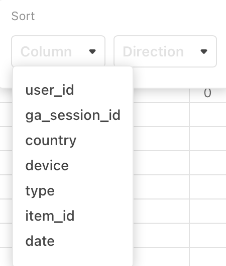
You can define multiple sort keys, which is useful when there are duplicate values in some columns.
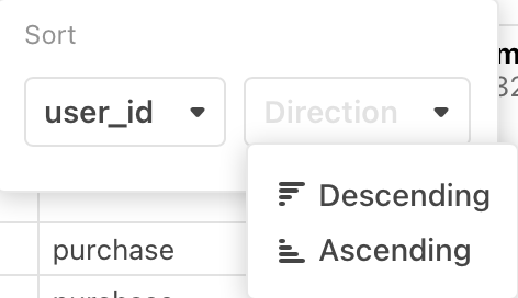
For each sort key column, use the Direction pulldown to select a Descending sort or an Ascending sort.
You may wish to define your Filter criteria first, to limit the returned results, and then do sorting.
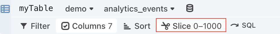
Slice
Use Slice to display only a limited number of rows from the table—for example, the first N rows. (You may want to define your filter and sorting criteria first.)
By default, Slice is set to display rows 0-1000:
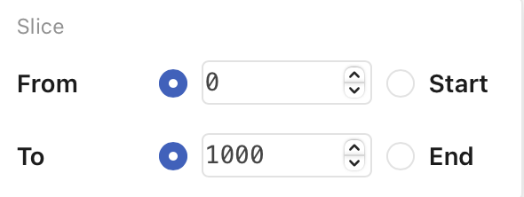
Once you have defined the lower and upper limits of the slice, press Enter to apply the limits (or click the Slice button again).
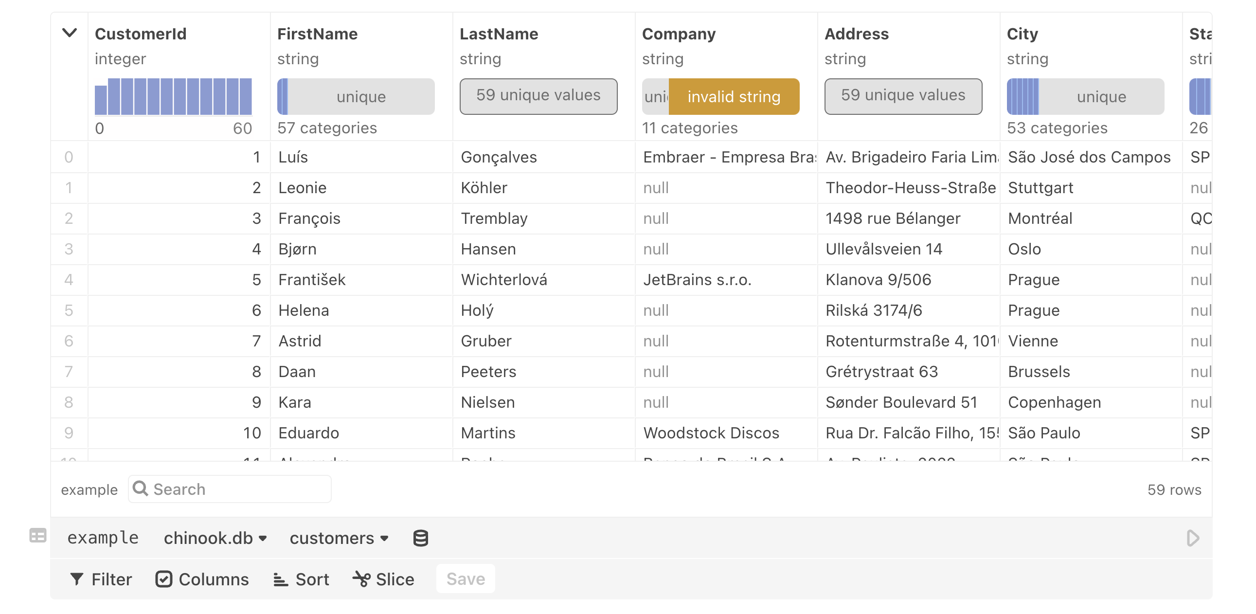
Summary charts
These small graphics at the top of each column provide a quick summary of key data characteristics for each column below.
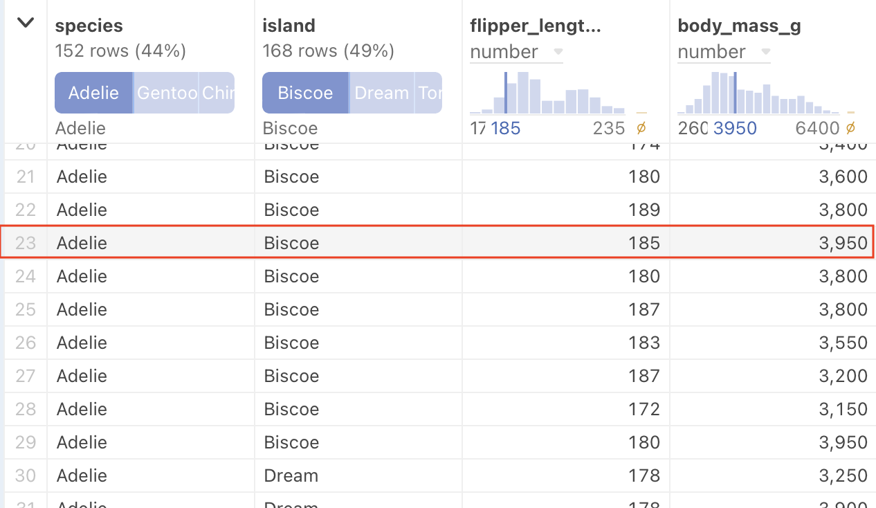
Note also, that the small charts are interactive. When you hover the pointer over each chart, you can get even more detailed information. By sliding your mouse along the displayed values, you can see individual values for each histogram or bar chart segment. Compare the following figure with the previous one:
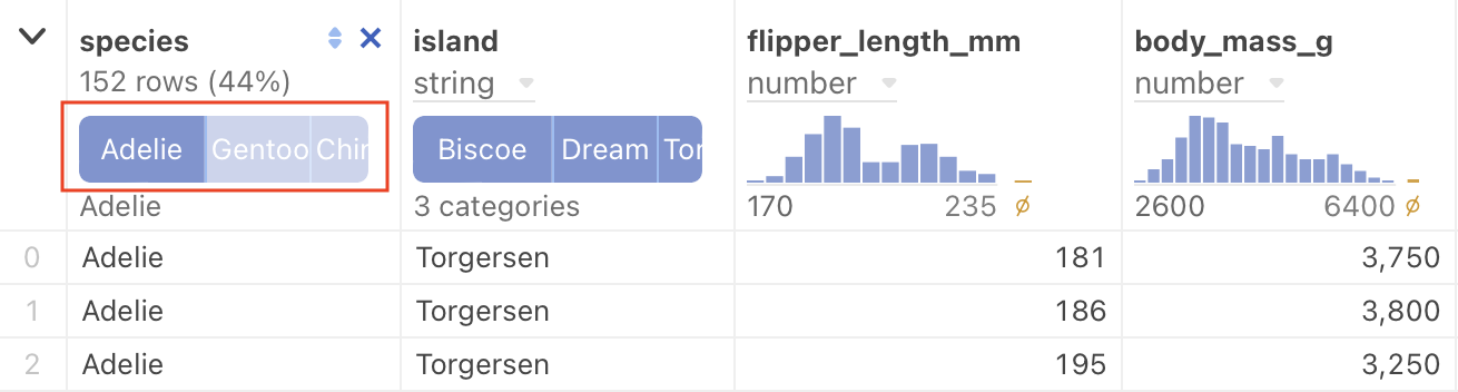
By hovering over the dark bar in the highlighted chart above, we now see additional information:
- The bar represents 152 rows of the total, or 44%.
- The variety of penguin selected is “Adelie”.
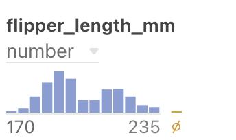
Here is another example, this time a histogram. Before hovering under an individual vertical bar:
Here is the same histogram, after the pointer is hovered just under the tallest vertical bar:
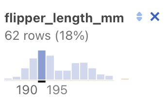
We now see additional information:
- The bar represents 62 rows of the total, or 18%.
- The values in that column range from 190 to 195.
Null sign results
Earlier we saw a histogram bar with the null sign:
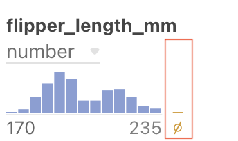
This bar represents results that are invalid. Hovering under this bar causes a message to that effect to be displayed. If you click the bar, the column will display the invalid results. In the following example, “NaN” stands for “Not a Number”.
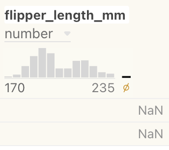
To de-select the invalid results, select the null set bar again.
Selecting results
By pressing the Command/Ctrl key while clicking on a summary chart, you can select partial results in a column. Only the selected results display:
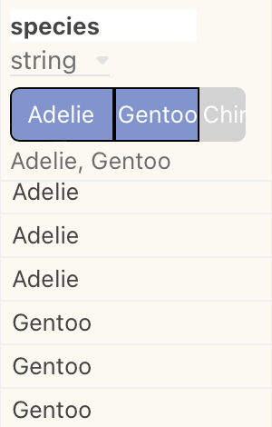
Command/Ctrl key to select results within a column.Notice also that the background shading of the column changes. To clear the selection, click on the selected result again.
For a column displaying continuous results in a histogram, you can define a selection range, which can be adjusted in size, or dragged to a new location.
Note
When defining a selection range, be sure the crosshair (+) cursor is visible.
To clear a selection in a histogram, click the crosshair cursor outside the selection (but still in the histogram area).
Saving column result selections
If you have defined a column result selection, as described in Selecting results above, you can click the blue Save button and your selections are saved as a filter:
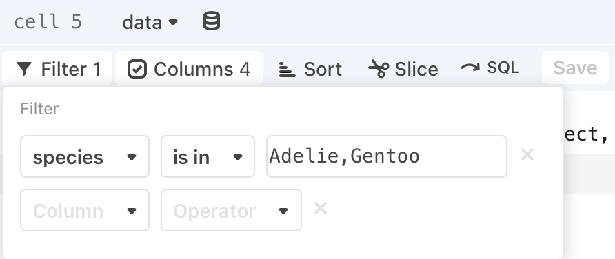
To clear the filter, select the X at the right of the filter specification.
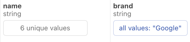
Text results
If the column contains values that are best represented by text only, the summary charts display a descriptive message:
Interacting with rows of data
In addition to interacting with the columns in the summary charts, you can interact with the rows of data. Hovering over a row of data causes individual marks in the summary chart to highlight.
In the following example, the pointer is hovered over the highlighted row. The summary charts have changed to reflect the values in that row.
Note
The summary charts are an extension of previous work on the Summary Table
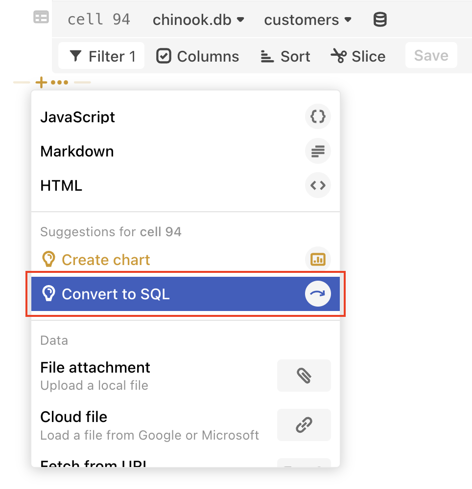
Convert to SQL
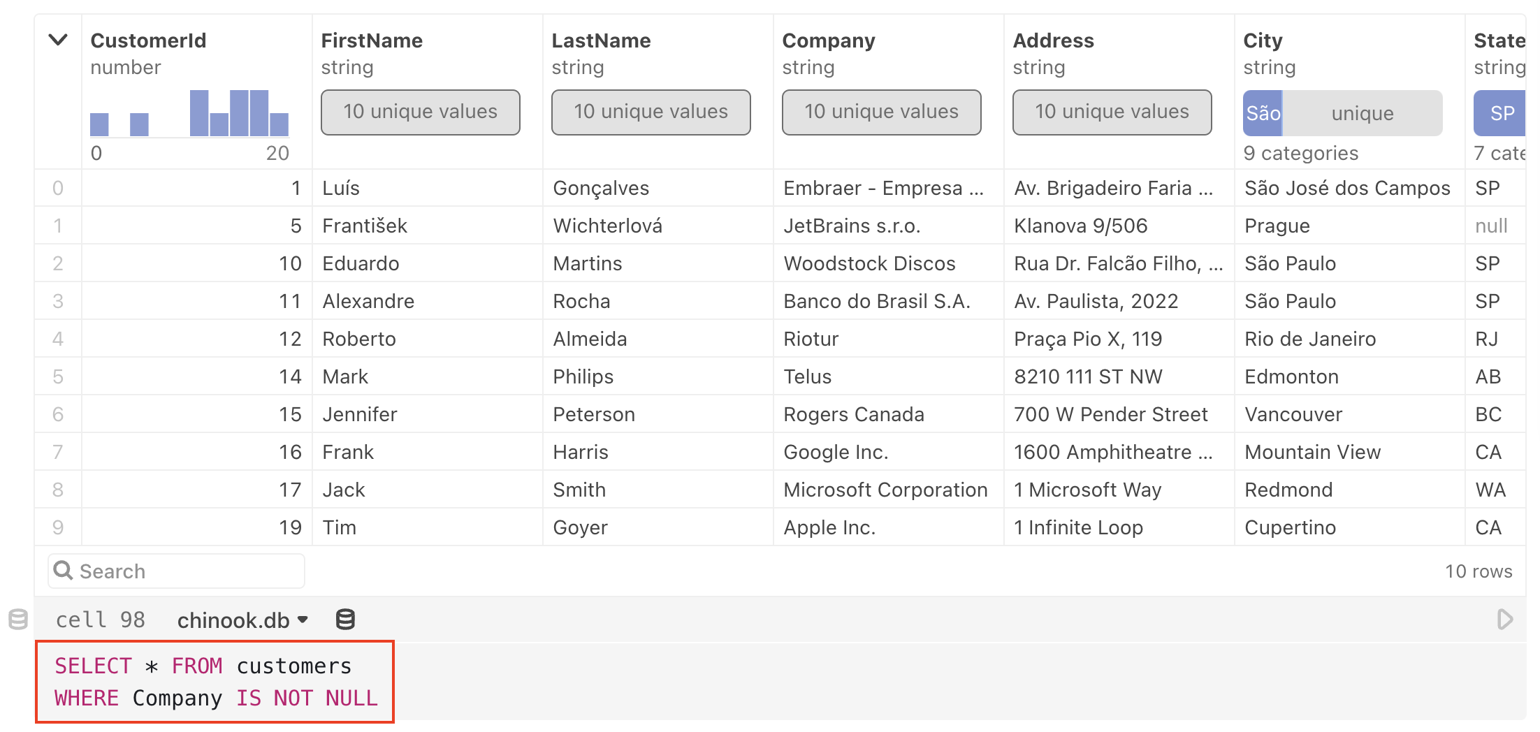
If you want to create a hand-tuned SQL query on selected results, you can convert a populated data table cell to a SQL cell. Select the + below a data table cell and select Convert to SQL.
A new SQL cell appears, with the same columns, filters, sorts, and slices:
Additional info
- If you want to refer to the results from your data table cell in another cell, you will need to give the data table cell a name.
- You can also use a custom database client as a data source for a data table cell. In order for a database client to be recognized as a valid data source, it must satisfy the requirements outlined in DatabaseClient Specification.